High Converting Landing Page
2021-09-09
Understand your target audience and design the right sections to communicate your value in a compelling way.
To create a high-converting landing page, you need to understand your target audience and design the right sections to communicate your value in a compelling way.
In this article, we'll do a Landing Page Audit on our favorite landing pages: Stripe and Slack.
Hero Section
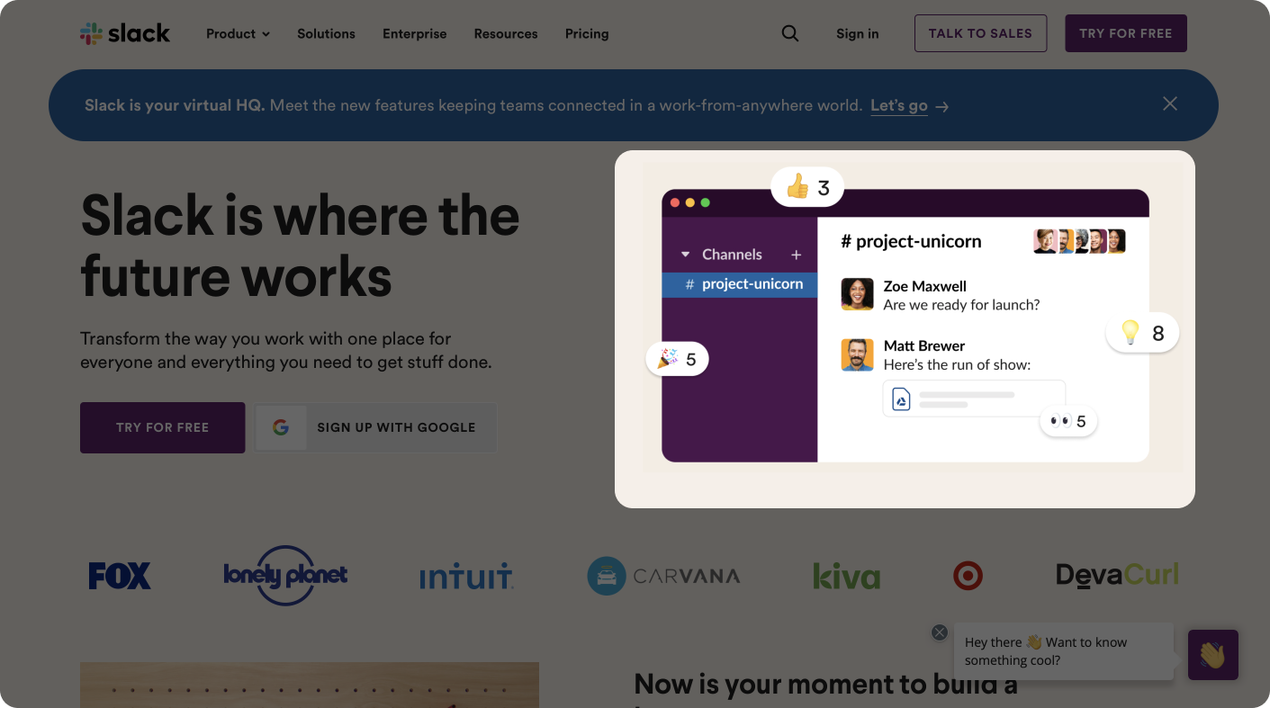
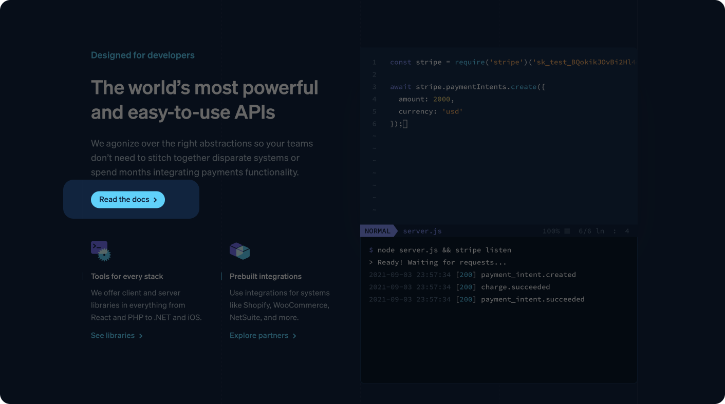
The hero section is the first thing visitors will see on your website, making it the most important section. Therefore, make it clear so visitors understand what your product is & who it's for and captivating to give a good first impression.
Important components:
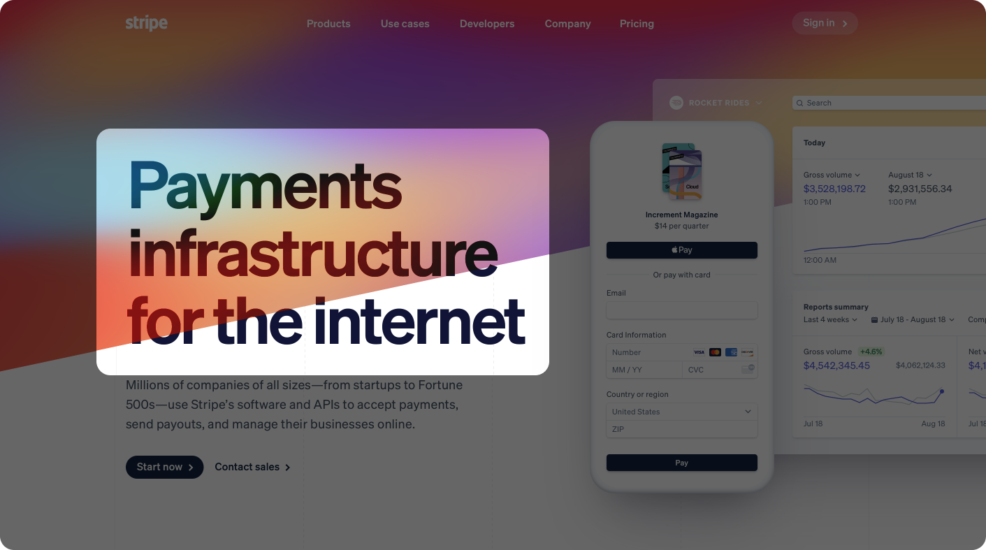
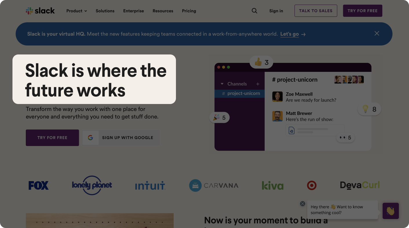
1. Clear heading: A 1-liner that explains what you do
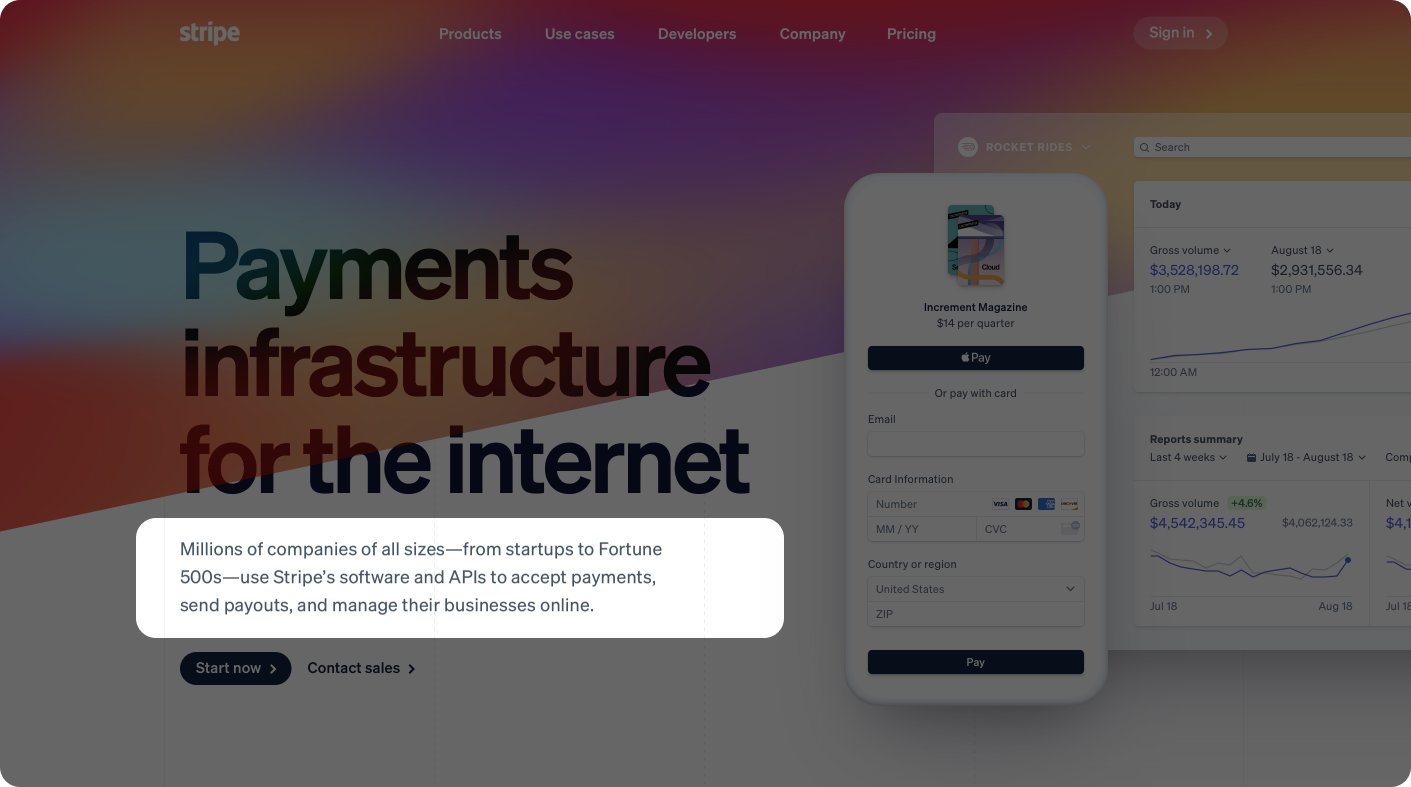
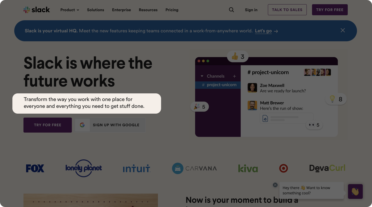
2. Description: A subheading that explains what the key benefits are
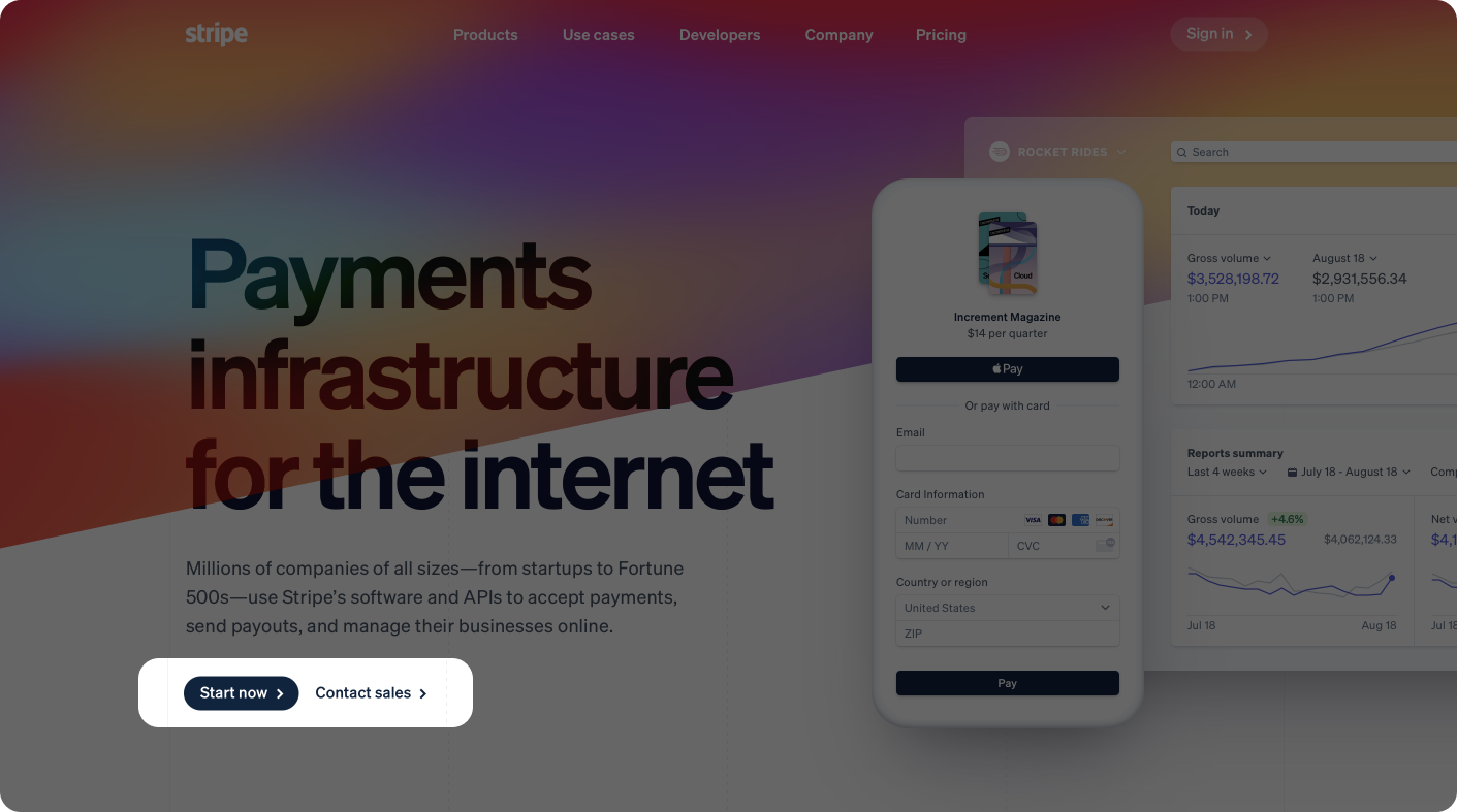
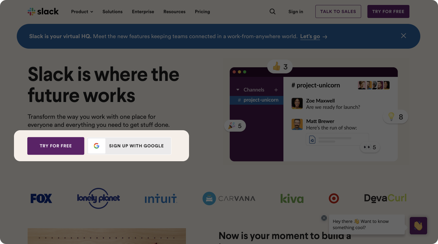
3. CTA: A button to get started
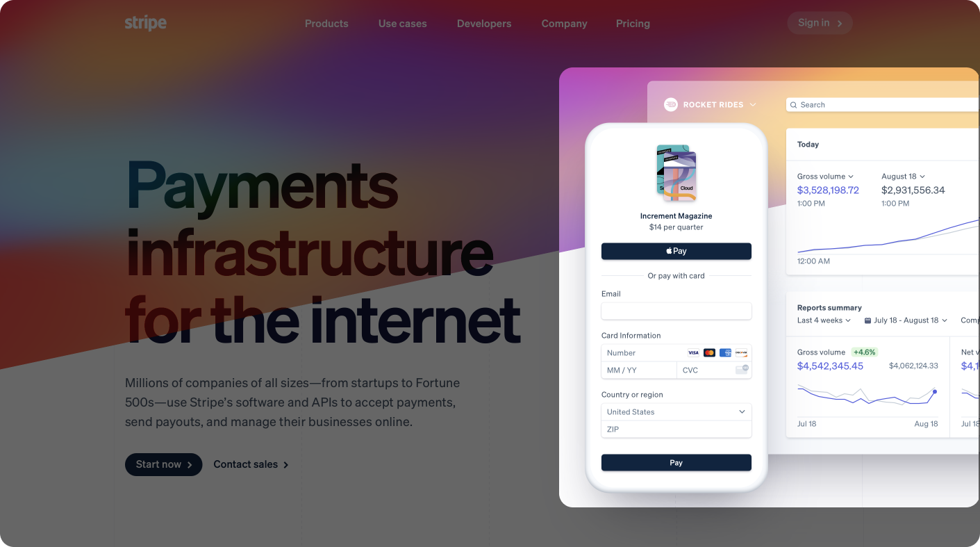
4. Mockup: An image/video to highlight core features
Clear Heading
A 1-liner that explains what you do
Description
A subheading that explains what the key benefits are
Call-to-Action (CTA)
A button to get started
Mockup
An image/video to highlight core features
Social Proof
The fastest way to add some validation/credibility to your product is by:
1. Listing your customers 2. Displaying your customers' testimonials 3. Listing your partners' logos
Feature Walkthrough
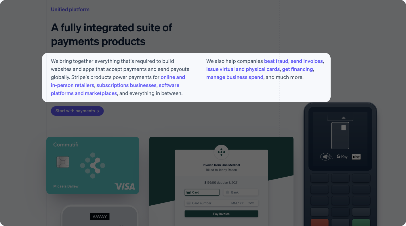
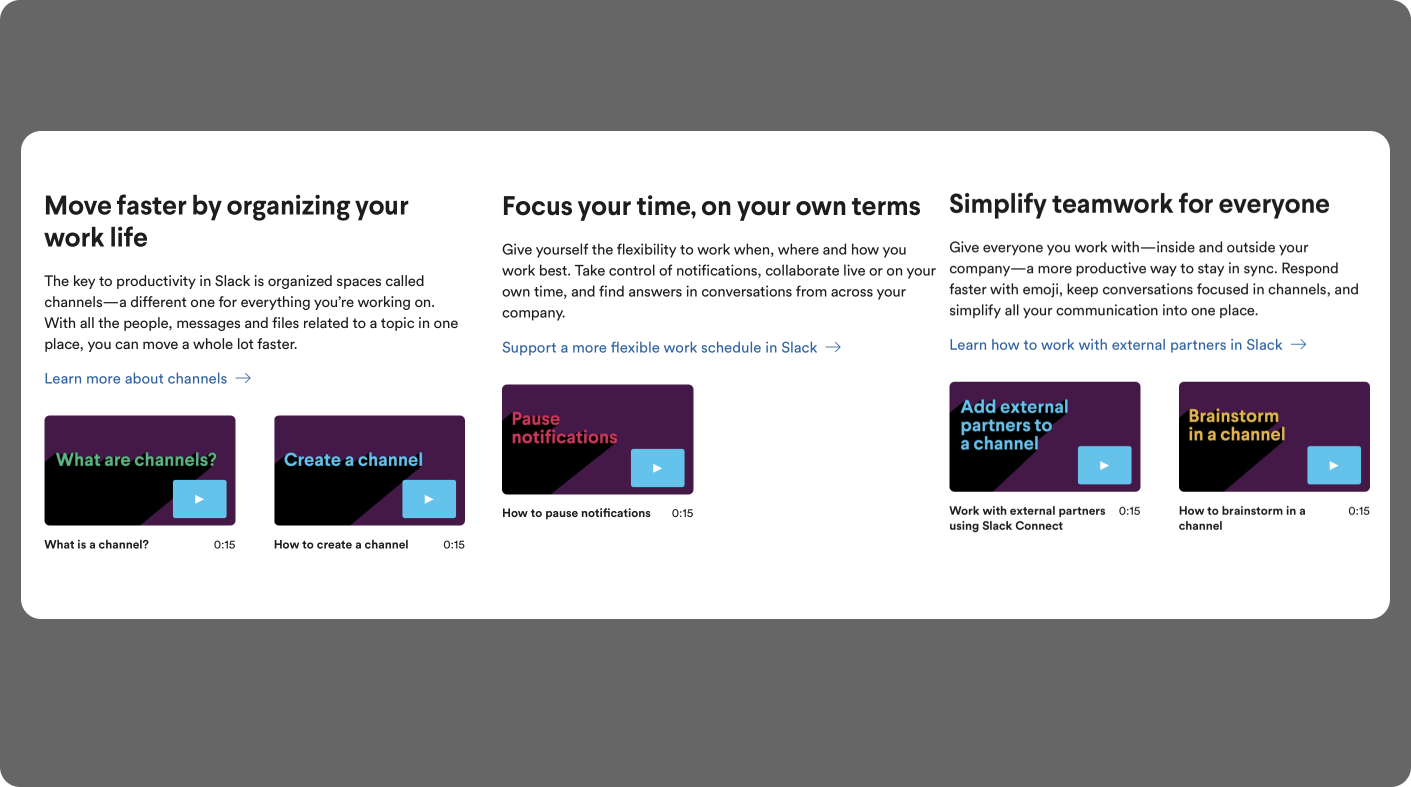
Use this section to dig deeper on how the features actually create a solution for your target customer.
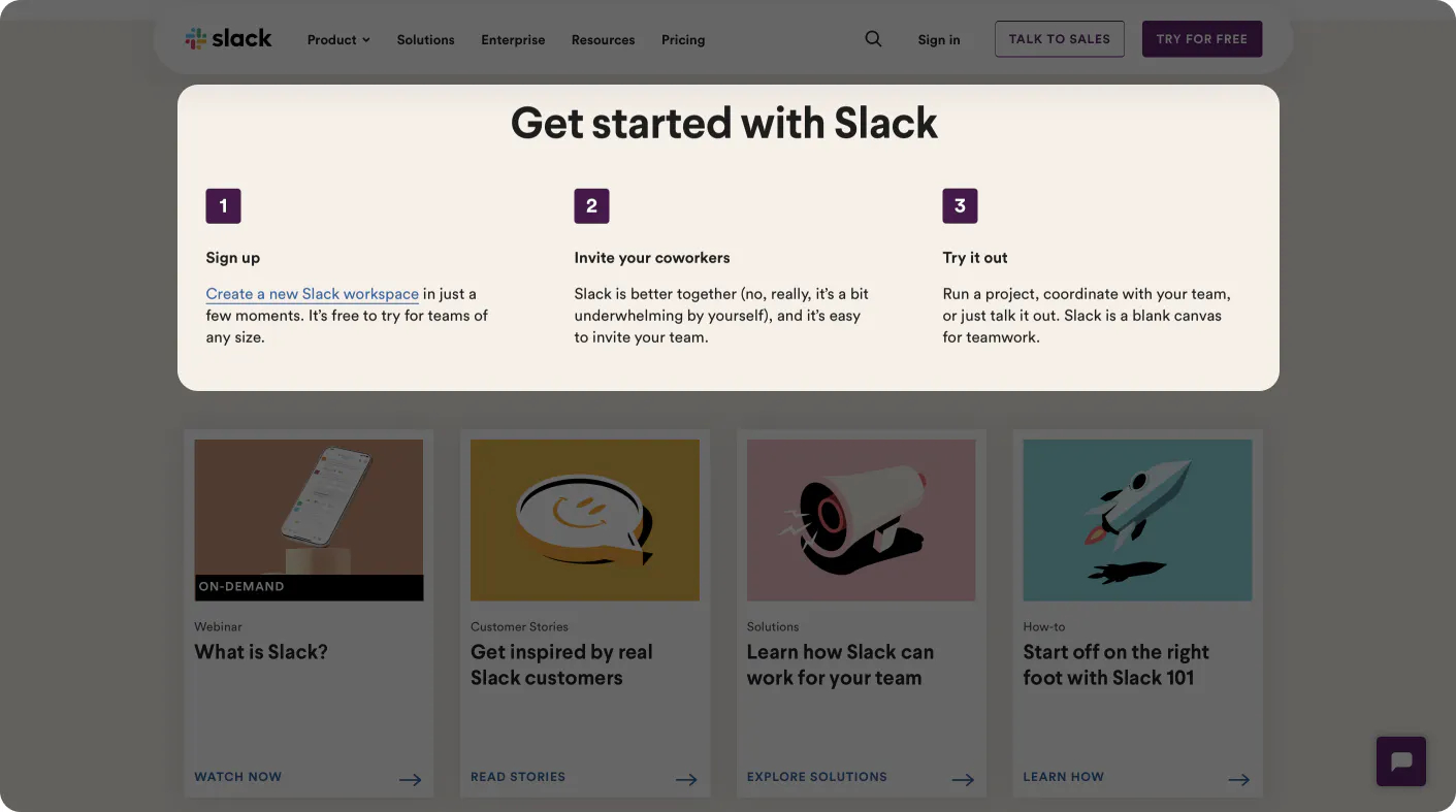
How to Get Started
This section is to provide more details into the "Get Started" CTA. It is used to outline the steps needed to start using your product.
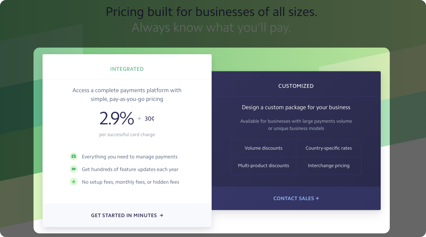
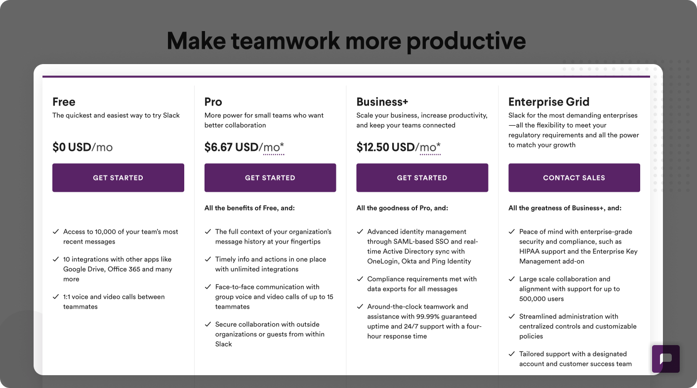
Pricing
Before your visitors make a decision to sign up, they will check your pricing section.
Handle objections upfront and save your time by only servicing people who are still interested in your product even after knowing the price
Clear, transparent pricing showing exactly what features are included in each pricing tier
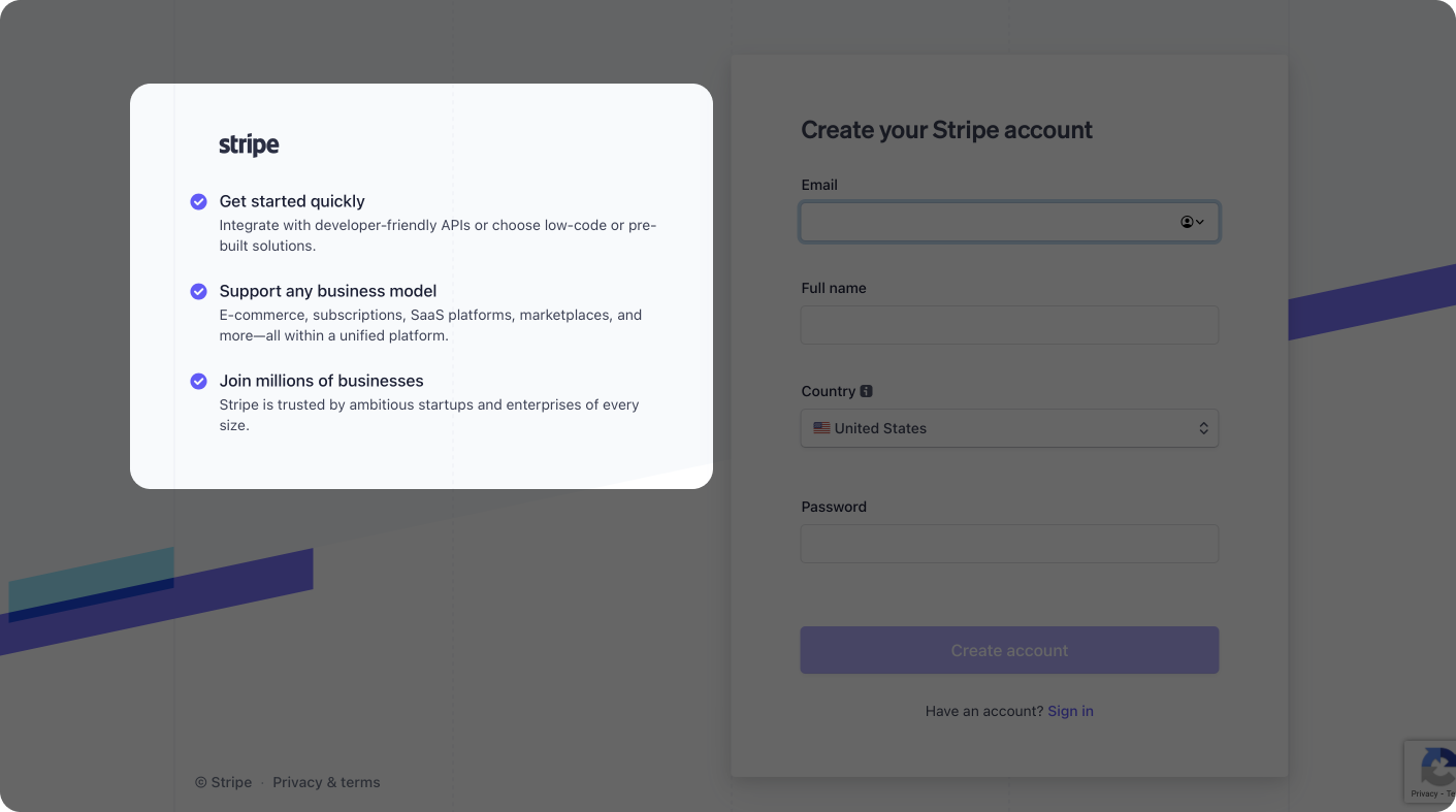
"Lead Magnet" Sign Up Form
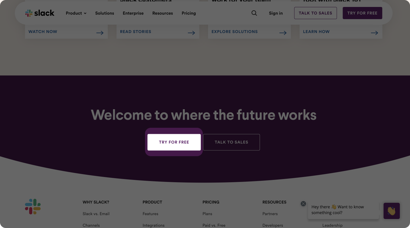
After going through the Social Proof, Feature, Pricing, and How to Get Started sections, close your Landing Page with another CTA to invite visitors to sign up. Make your CTA/Sign Up Form a "lead magnet" to incentivize visitors to sign up:
"Free trial"
"Get started quickly"
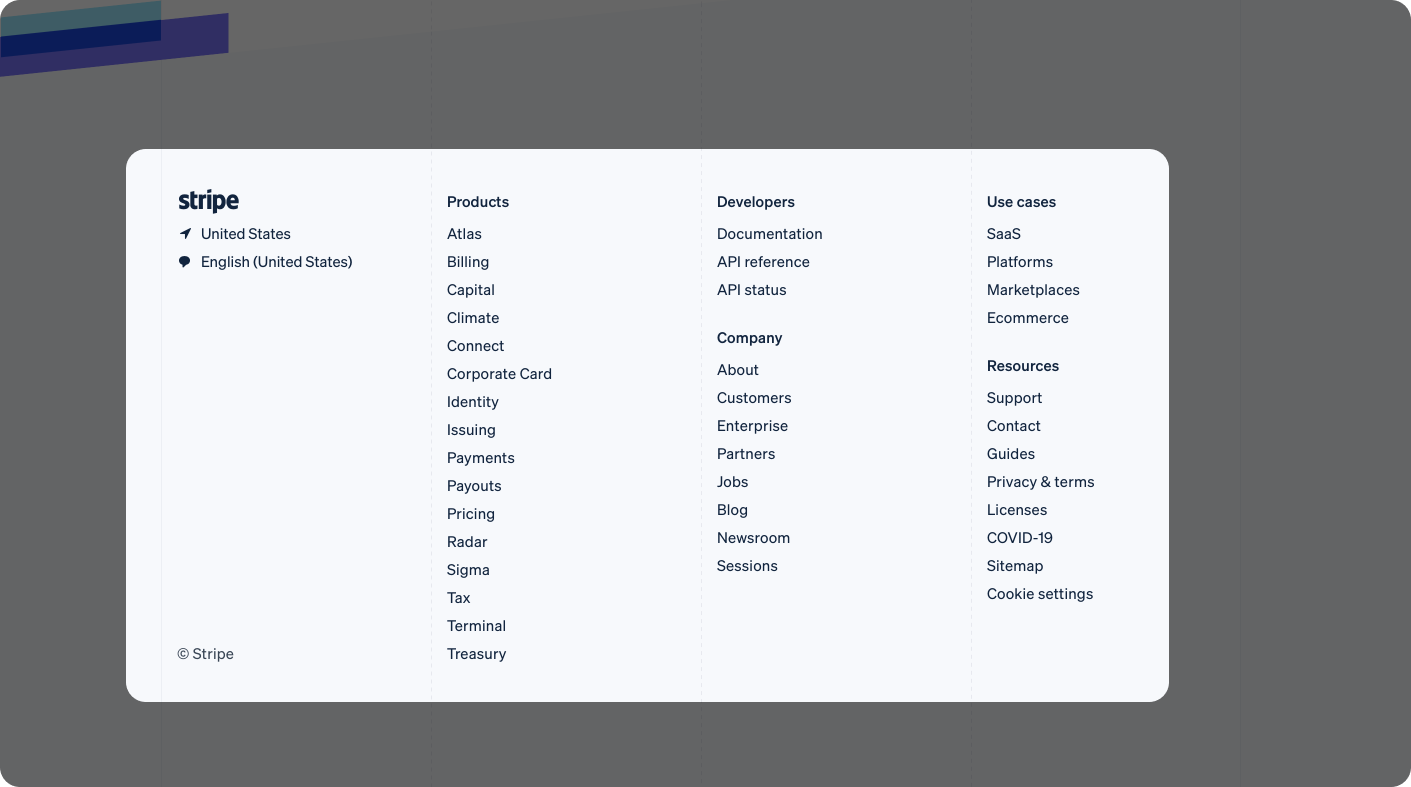
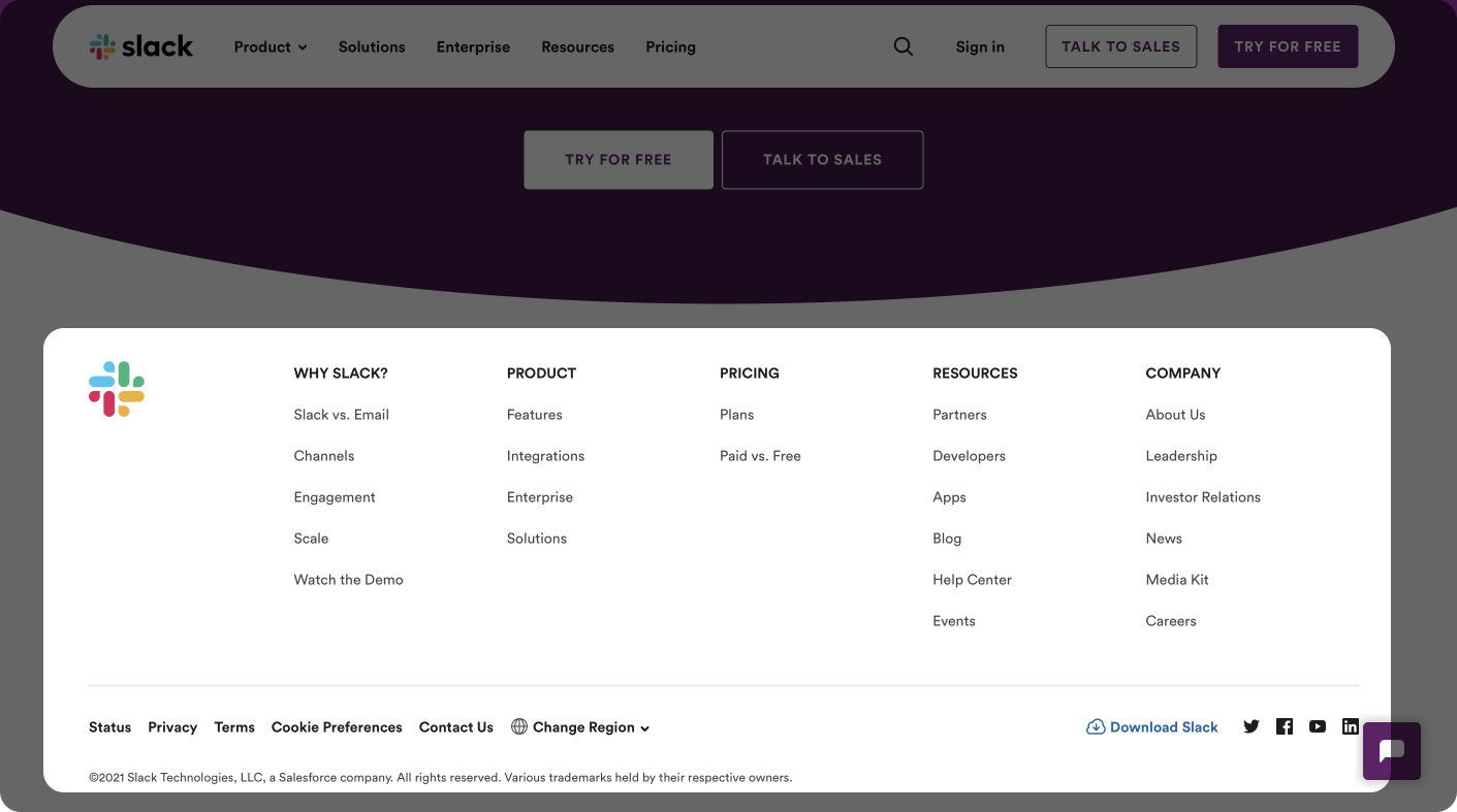
Resourceful Footer
Include links to all kinds of resources visitors might need.
See More Posts
We're a remote software company, building online tools for creators, builders, and side hustlers. We quit our 9-5 to pursue our dreams, and we want to help others do the same.
Backed by
Copyright © 2023 Govest, Inc. All rights reserved.
