Typedream Tutorial: Build an Animated Personal Site
2022-06-20
A fully-animated personal site designed for online and offline creators.
Typedream Tutorial: Build an Animated Personal Site
The Outline
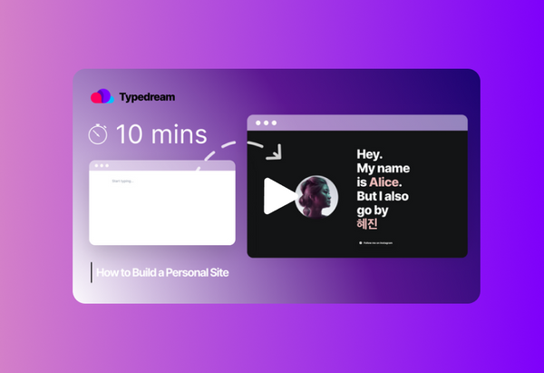
Hey friends, today we’re going to be showing you how to create a personal site using Typedream. We’ll show you how to use scrolling words, animations, cards, font styling, and section templates to build a page that you can use as your elevator pitch.
Alright, let’s get started.
Hero Banner
First, we’re going to make sure our hero banner pops out because it is the first thing your site visitors are going to see.
Start by creating a block with 3 columns. You’ll be seeing this structure reused multiple times throughout the site. Stretch it out and resize.
After we’ll add an image. Type /image and select the file on your computer.
Then we’ll write some text. Let’s make it big. Highlight the text, go to Settings, Text Style, and Title. We can also add an accent color to the names. I’m gonna use a light magenta here. If you have multiple names (or nicknames), a fun way to add them to your website is to use the scrolling words effect. Highlight, then go to the Advanced tab, and under Text Animation, add your other names.
We’ll add a button too for the primary CTA. /Button, “Follow me on Instagram” - you can change this to whatever suits you. Add an Instagram icon and we’re done with the hero banner.
Section 1
Now we’re getting into more of the text-heavy part, so we’re going to balance that out with some nice emoji cards.
Again, create three columns and this time, adjust so that the right-most column is slightly smaller than the left.
We’ll put the container on the right. Type /container, then under Container Style, choose Card. This will give it that nice corner radius and shadow.
We’re going to use a gradient in the form of an image as the background, so hit Add Background Image, then browse for the file.
Now we add the emojis and drag and drop them right into the container. Let’s make that center-aligned and a bit bigger, nope too big, ah there we go. Gonna add some text real quick.
For the animations, select the text block, go to Advanced Settings, then Add Animation. We want the text and the card to converge. So things on the left will slide into the right, and things on the right will slide into the left.
Section 2
Let’s duplicate the block since the next one is going to be pretty much the same. The only thing that’ll be different is that now we have the text on the right and the card on the left - just to add a bit of variation.
Oh also, instead of uploading an image for the background this time, let’s explore the preset gradients library. If you go to Add Background Image, then Resources, then Gradients, you’ll see a ton of cool gradients. For now, we’re going to choose Charcoal. Now let’s add more text.
Section 3
The third block is going to be exactly the same as the first layout-wise. So duplicate again, then I’ll just change the content.
Footer
For the footer, I could create my own, but I’m too lazy so I’m just going to take a shortcut here. Type /section templates and we’ll go to CTA.
We’re pretty much done with the site. Now we just have to add links to our buttons. We’ll be adding external links, but you can also add internal links (we have a short tutorial just for that so make sure to check it out if you haven't already).
Let’s go into X-Ray Mode to see if everything is lined up and good to go. There we have it, a personal site done in under 10 minutes.
See More Posts
We're a remote software company, building online tools for creators, builders, and side hustlers. We quit our 9-5 to pursue our dreams, and we want to help others do the same.
Backed by
Copyright © 2023 Govest, Inc. All rights reserved.


